


This is what colour nerds do.
Seriously, I stayed up way late for this, and woke up just wanting to gaze at the pretties!
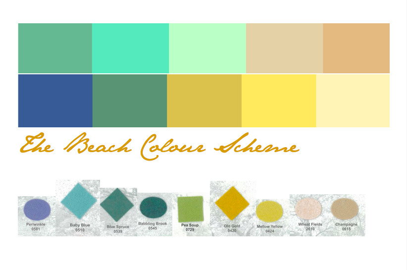
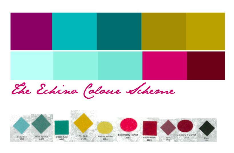
I’ve been thinking a lot about colour combos lately, and how to make the bright saturated colours I love a little more… palatable for felt brooches. I love red, yellow, blue and turquoise, but it’s too much for even me when they are all together in one flower.
I started looking through online colour scheme generators, and pulling the ones I loved into a Pages document. I was really pleased to find that the ones I choose all fit into one of the four groups above, which all have some very similar tones of turquoise and mustard yellow! I don’t naturally go for neutrals, but in most of the colour schemes above, it’s the taupe or grey that really pulls it together. A good lesson for me, I think! (Anne, are you hearing this??!? I am singing the praise of NEUTRALS!!!! Ha!)
The final step was the slowest - Pulling swatches of wool-blend felt to match the colour schemes. I’m really happy with the result, and my felt order is going to much more targeted as a result. No ugly colours on a whim - Just colours I can combine in many ways! My fingers are itching to get started!
No comments:
Post a Comment