Q: What’s a sewist to do when a cold keeps her away from the sewing machine?
A: Reformat the blog from the comfort of bed!
Those of you who visit my blog in person (instead of on a blog reader) might have noticed that I tinkered around recently to update the look.
I started this blog last November, and went with Tumblr because I like the simplicity of the interface. Here’s what it looks like when I write a post:
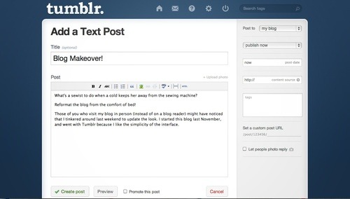
Isn’t that nice and simple? When I tested out Blogger and Wordpress, I really didn’t like the cluttered dashboard. Somehow it just threw off my creative process! (But maybe there is a way to simplify the interface?) Anyway, I ended up with Tumblr, and chose a free template.
The problem with free though, is that you don’t get much control. Seeing as blogging has now become a big part of my sewing life, I figured I was due for an upgrade! Time to pony up and pay for something better!
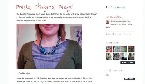
I went with a Tumblr template called Atlantic Noir (Click here to see some different blog versions of the same template on Pinterest). Here were my criteria:
- single column for content
- allowed for different fonts
- connects to flickr and social media
- shows the real date of posts (I have an irrational hatred for templates that only say “two weeks ago”!)
I also wanted to update my header to make it less twee and more modern, and reflect the fact that most of my sewing these days is clothing.
So, I went from this, which I’d made using a word processor: 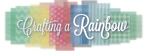
To this, drawn on an iPad!
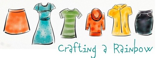
Have you ever used the Paper app? It was my first time, but man oh man, does it make chicken scratchings look good! There is a pretty narrow range of colours, so I did tweek things a bit in a photo editor… but it really only took 30 min to sketch! I wanted something more organic and clean, but still with the bright colours that I love. Some of the garments are real things I’ve made… other are imaginary adaptations. Can you name any of the patterns?
I’ve been noticing a shift in my personal style lately: away from the pale coral and teal of the Colette blog aesthetic, and toward for graphic, bold lines. (“But, GIllian!” you say, “You still have teal headers and coral highlights!” Yes, yes, baby steps, ok?!) I have a tendency to want as much colour as possible on everything, and preferable lots of colours contrasting with each other for maximum rainbowy goodness. To that end, the blog very nearly looked like this:
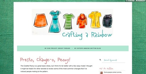
or this:
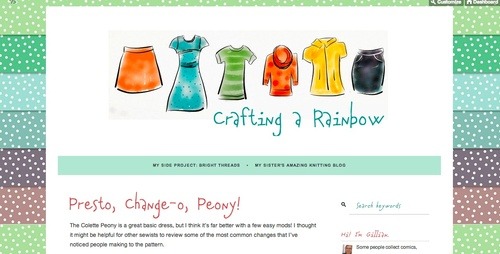
…which, let’s be honest, I still kind of love! But cluttered blogs drive me crazy, and anyway, isn’t the point for our sewing to look fabulous? I went through my blog roll and opened up 20+ blogs that I thought had good design, and looked for elements I liked. Overall, I was always drawn towards simple white backgrounds that let the content shine:
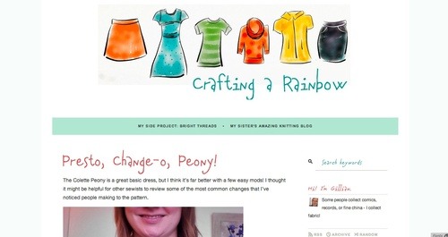
There you have it: A very long-winded explanation of my blog makeover process! Forgive me, please, for rambling on.
What I’d really like to know is how YOU go through the blog design process! How often have you updated your look? What do you want in a template or header/logo? Are you influenced by other blogger’s aesthetics? How does your blog design reflect who you are and what you sew?

No comments:
Post a Comment